Exam Question Repetition
Lisa Milroy
Lisa Milroy was born 19 January 1959 in British Columbia is an Anglo-Canadian artist known for her still life paintings of everyday objects placed in lines or patterns. She has also produced a number of different Paris -Sorbonne University. In 1978 she moved to London to study at Saint Martin schools of Art.. However, in early 1979, she transferred to Goldsmiths college, then transferring again, later in the year, to the University of London, staying there until 1982. Her first solo exhibition was in 1984 which was mostly based on still life. In 1989 she won the John Moores painting price. Milroy is currently Head of Graduate Painting at the Slade school of fine art, London. She gained election to membership of the Royal Academy of Arts in 2005 and was appointed a Trustee of the Tate Gallery in 2013.


My response to Lisa Milroy


Edits experimenting with styles


Karl Blossfeldt


Karl Blossfeldt is a German Photographer from Berlin, Germany. He is best know for taking photos of living things and plants. Blossfeldt's photographs were made with a homemade camera that could magnify the subject up to thirty times its actual size. By doing so he revealed extraordinary details within the natural structure of the plants. In the process he created some of the most innovative photographic work of his time. The simple yet expressive forms captured on film affirmed his boundless artistic and intellectual ability.
My Response to Karl Blossfield


Refining my response to Blossfield


Making experiments in Black and White Edits


Cory Arnold


Corey Arnold is a photographer and commercial fisherman by trade. He has worked seasonally as a commercial fisherman in Alaska since 1995, including seven years of crabbing in the Bering Sea aboard the Rollo. Corey now captains a commercial gillnetter, harvesting wild and sustainable Sockeye salmon in Bristol Bay, Alaska while living seasonally in an abandoned salmon cannery complex called Graveyard Point. His life’s work: He is an ongoing photography series documenting the viceral experience of life at sea for commercial fishermen worldwide.
Photoshoot 2


Edits


Albert Renger Patzsch
His Work


Renger-Patzsch was born in Wurzburg and began making photographs by age twelve. After military service in the First World War he studied chemistry at Dresden Technical College. In the early 1920s he worked as a press photographer for the Chicago Tribune before becoming a freelancer and in 1925 He had his first museum exhibition in 1927.


Edit


EDITING IN THE STYLE OF ALBERT RENGER PATZSCH


Step By Step Process
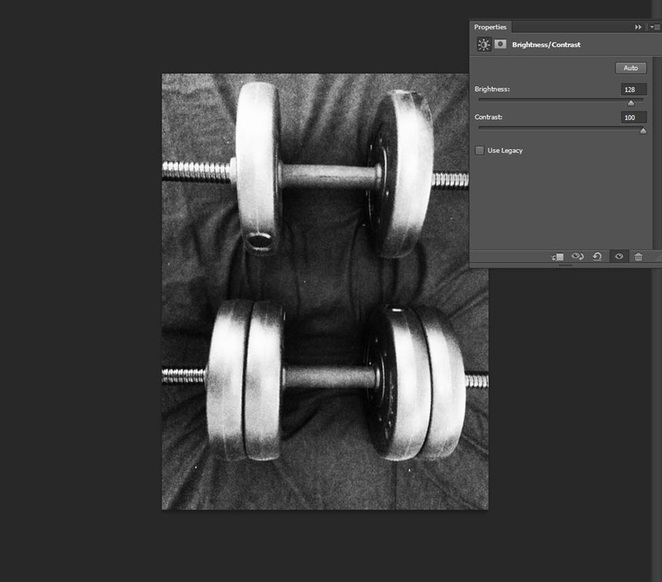
I used a higher brightness in my work, I made the picture a higher concentration to 128. I used contract and made it higher so it makes the picture darker. how I done this was that I went to properties and brightness/ contrast
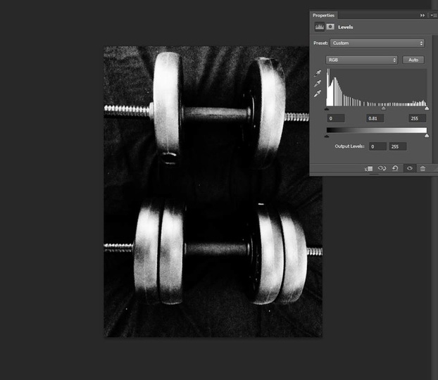
the second process that I done was that I used levels to make the picture darker. how I done this was that I went to properties and then I went to levels.
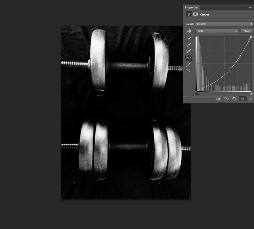
The third process was that I used curves to curve the picture darker so it shows the dum bells white and the rest of the picture black. how I done this was that I went again to properties and then went to curves and now the picture is done.
My Second Step By Step Process
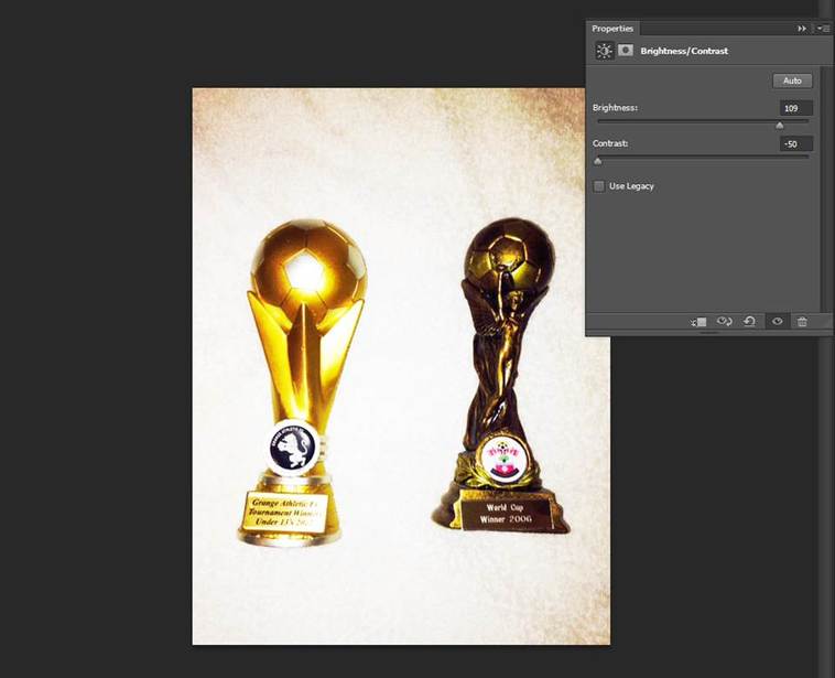
I picked this photo to edit because its one of my favourites and I reduced the contrast to -50 so the picture would look darker and more effective and increased the brightness to 109 so its lighter. how I done this was that I went to properties and Brightness/ Contrast
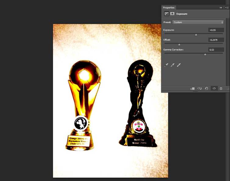
the second step of this process increased the exposure by 0.55 and I reduced the offset so the picture would look even more effective and concentrating I used gamma correction to add to this as well by increasing the density of it. How I done this was that I went to properties and then exposure.
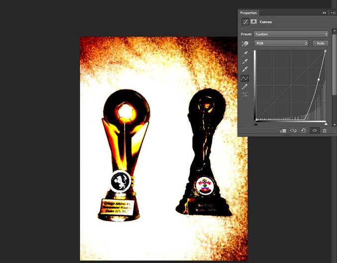
for my final process, I used curves because it is a strong theme it changes the picture to perfection. I used curves to lower the image and make the picture more effective. how I done this was that I went to properties and then I clicked onto curves.
My Third Step By Step Process
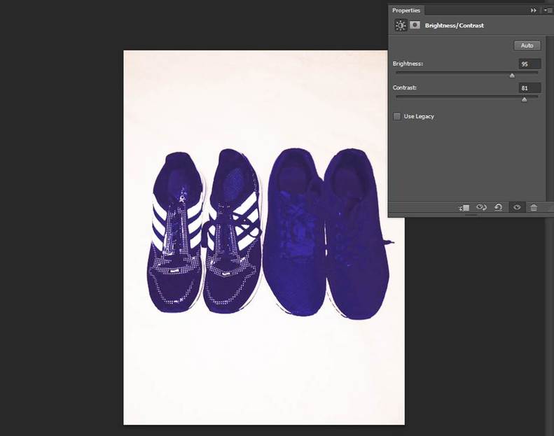
one of my favourite designs is trainers I used brightness by increasing it and lowering the contrast to make the shoes stand out brightly. how I done this was that I went to properties and Brightness/ Contrast
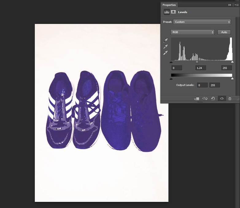
in the second process I used levels to increase the concentration of the picture. you increase the levels by dragging the point to the left. how I done this was that I went to properties and then levels
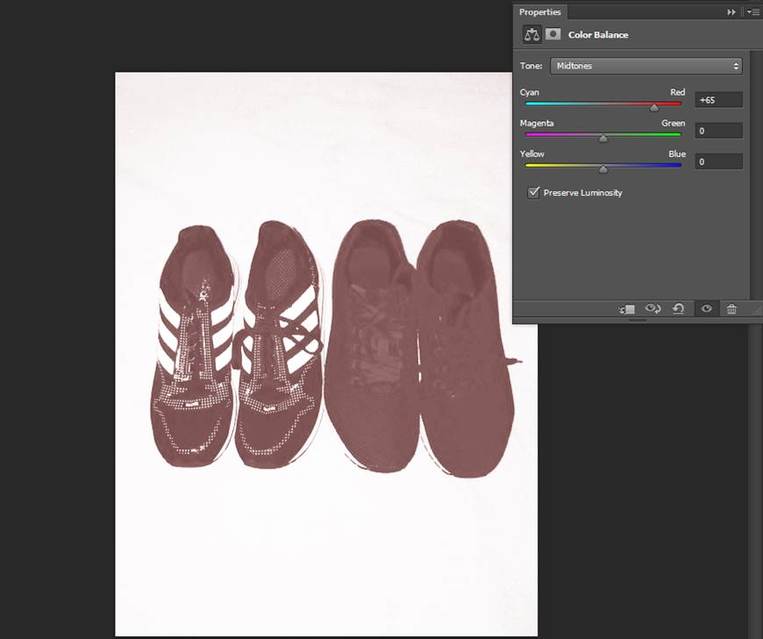
This made a lot of difference to the picture because I used colour balance to make the shoes red. I picked red because it is my favourite colour and I used black and white to make the background white and not a colour I increased red to +65. how I done this was that I went to properties and I clicked on colour balance and black and white.
Ghosting with Repetition
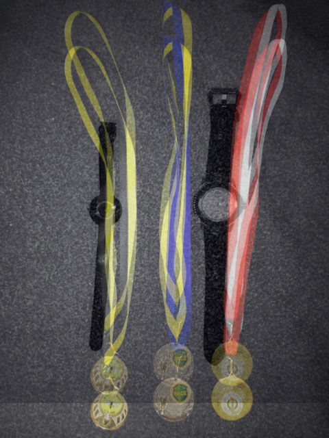
I constructed this photo even better as my first ghosting image because I like to look back on some my achievements I got from the past which is medal's which I got got from football. I mixed it in with watches because I like the fashion of watches. I made these images bond together because it makes me more confident and it shows a powerful effect on me in a good way. I also put these two pictures together because I thought they would be a good match and make the picture more stronger.
My Step By Step Process To Show How I Made This Image
Firstly how I made this image was that I opened up Photoshop and then I went to file and then open. Then finally I clicked on the image where I saved it in and then it opens up like this.
I clicked on the same process as last time, file and then open and clicked on another image which is saved, so it opens up like this. you should have now two images on separate slides.
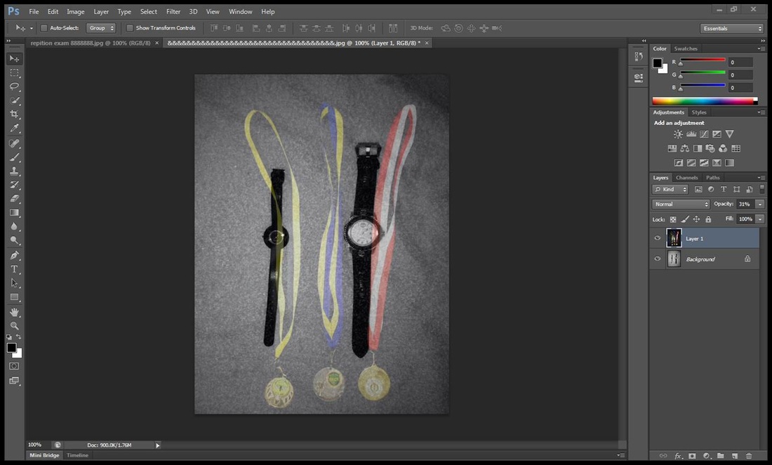
now I used the select tool and dragged the medal objects into the object of the watches by dragging one picture into the other slide. But then I put the image over the top of the other image so it covers the whole page and then I used opacity to decrease the image into ghosting so you can see both pictures into one. now the picture is done and ready.
My Second Step By Step Process
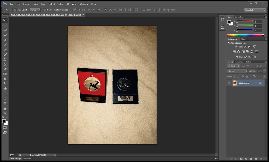
I went to file and then open to open up the image which is saved so it ends up like this.
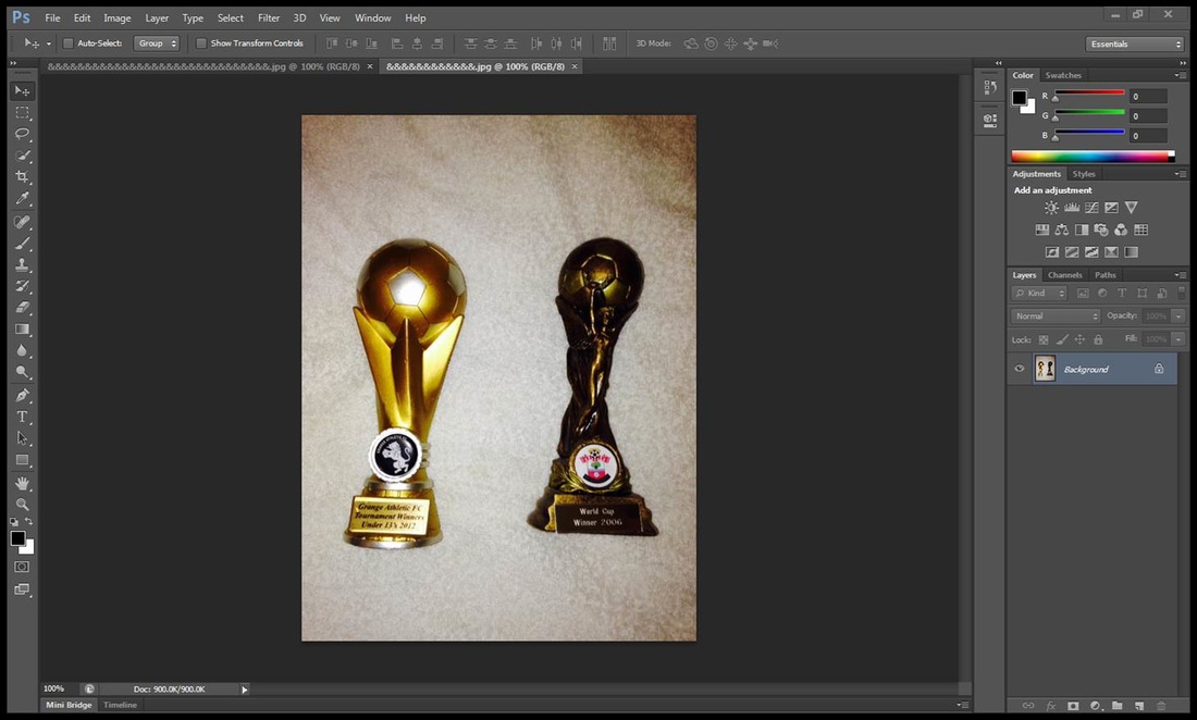
I clicked file and open again to open up my second image which is saved so there is two slides. it should end up like this.
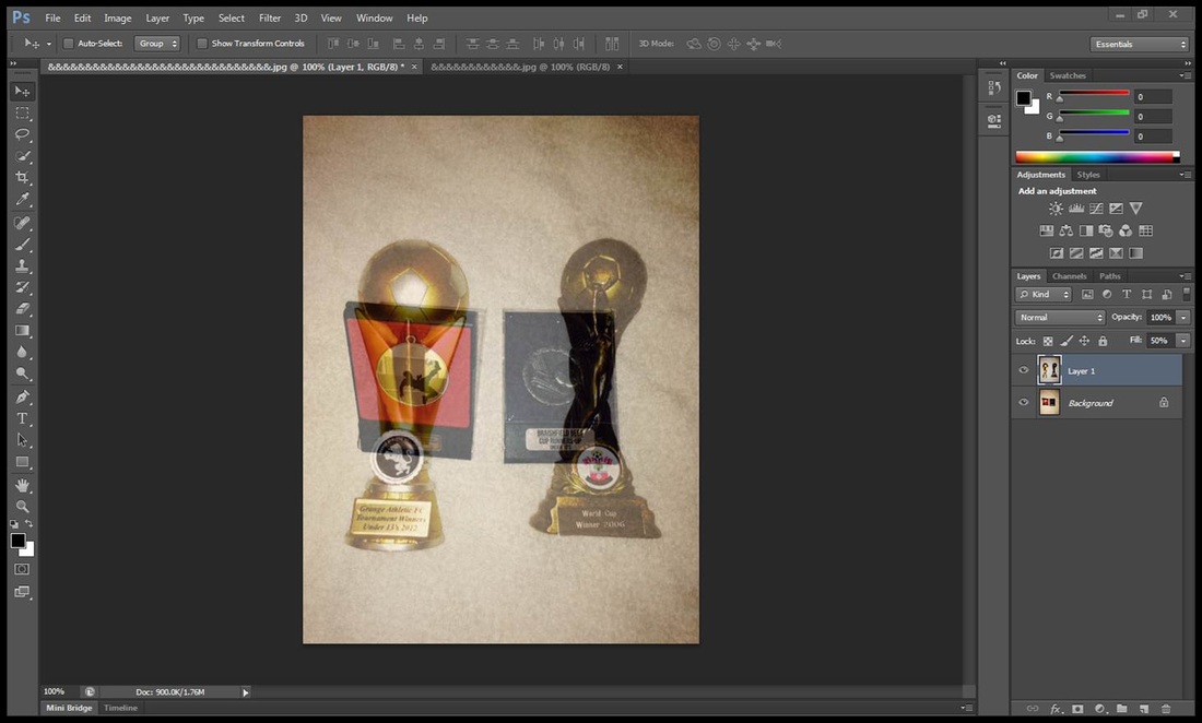
I combined the two images by clicking on the photo of my trophies and dragging it onto my second slide. I then decreased the fill tool to 50 percente so you see both images.
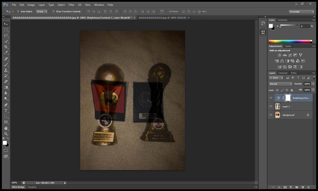
I then went to properties and clicked on an adjustment called brightness/contrast. I decreased the brightness down so the centre of the image is darker so you see the picture better and I also reduced the contrast down so the edges/ background would make the picture darker. it should end up like this.
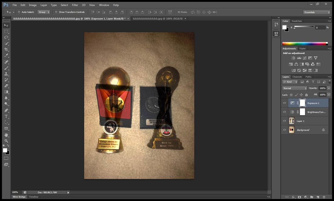
I went to properties again and clicked an adjustment called exposure. I increased the effect so the centre of the two images combined would become lighter so the images would stand out. And that's the finishing product.
My Third Step By Step Process
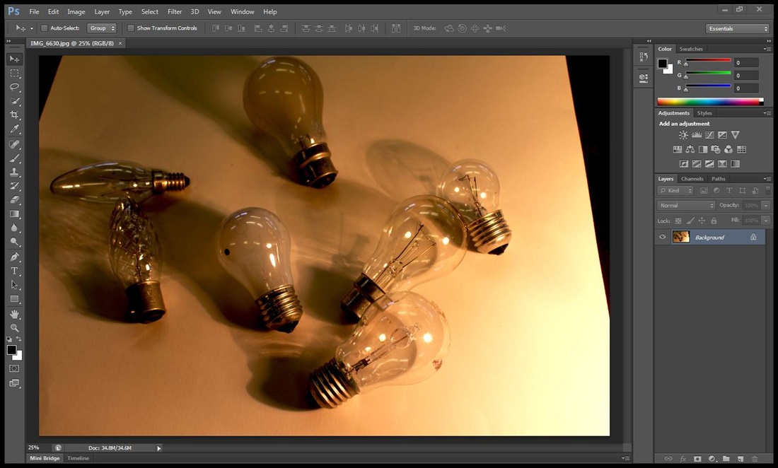
I went to file and open and opened up my image which is saved so it ends up like this.
I then clicked on file and open again to open up my second image so there is two slides of pictures.
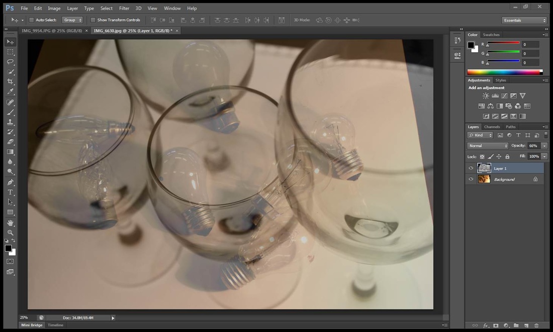
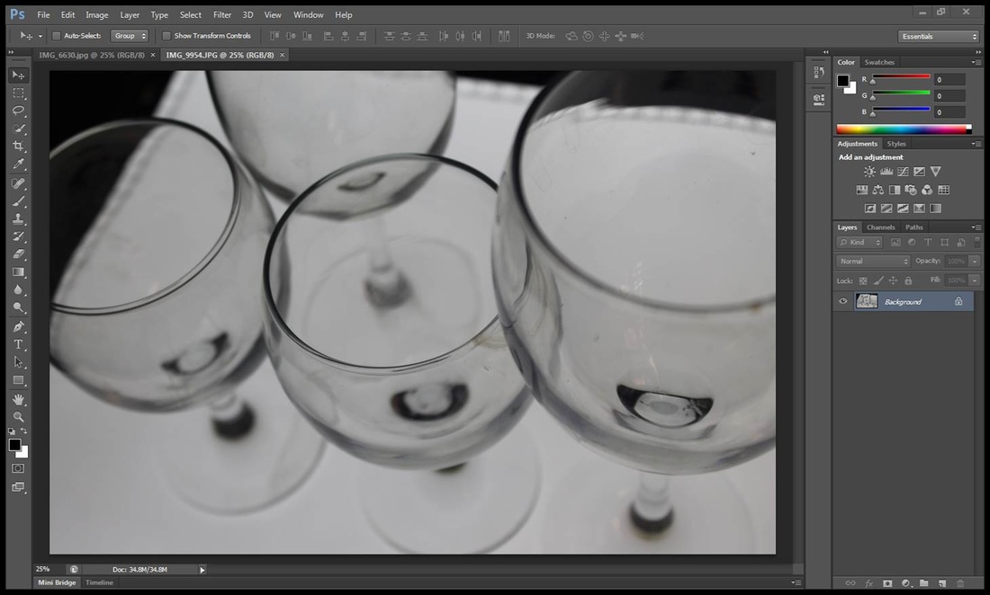
I then dragged one of my pictures which is the image of the glasses and placed them into the second slide on top of the light bulbs image so it covers the photo. I reduced the capacity to 66 percente so you see both images put together.
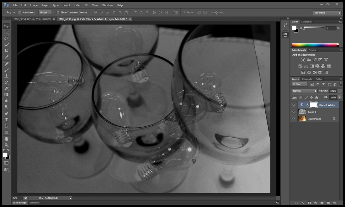
I then went to properties and clicked on the adjustment black and white effect to it has a different and better effect. but how I got to this is when I clicked on the black and white it came up with colours so I reduced the red colour to see the light bulbs blend in and I reduced the yellow colour also so the background blends in with the images put together. You now have your third process image.
My Fourth Step By Step Process
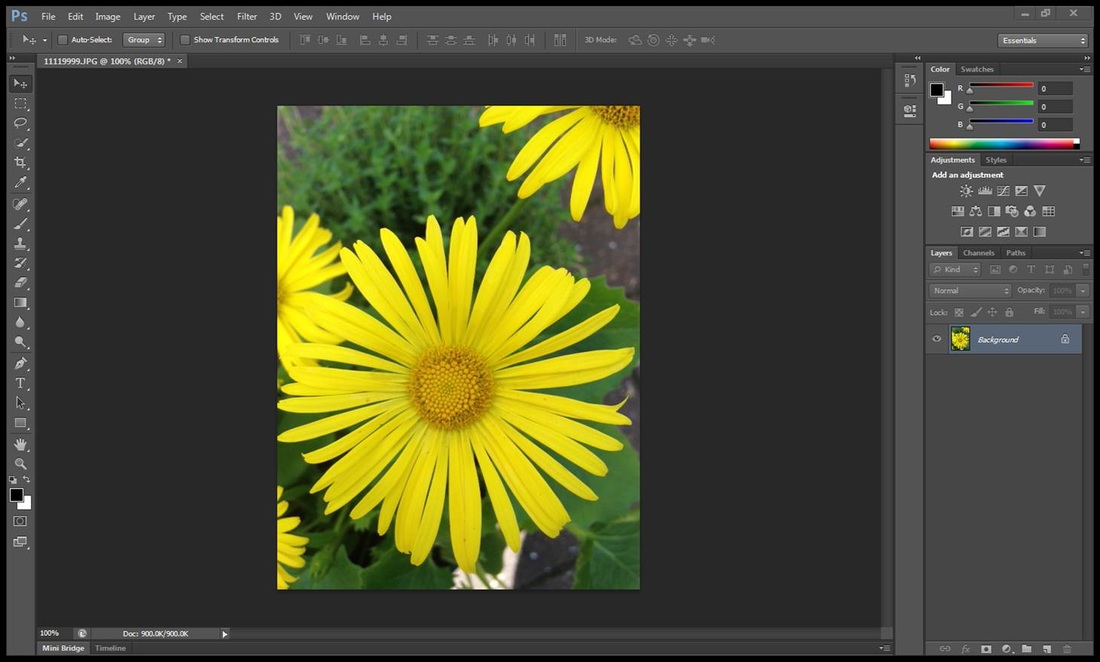
I clicked on file and then open to open up my first image which is saved.
I opened up my second image from file and open so I now have two slides of pictures
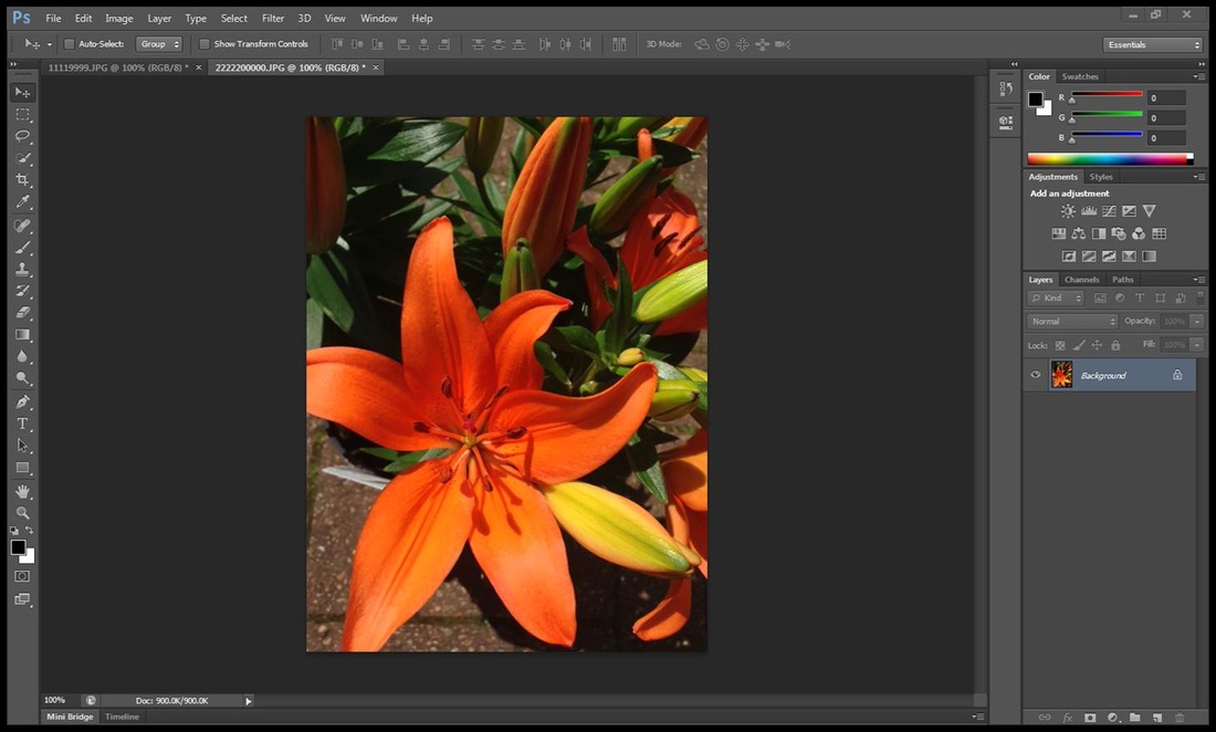
I opened up my final image from file and open so I now have three slides of images.
I transferred the image of the orange flower onto the first slide which is the yellow flower so I have two images on one slide. I then reduced the opacity so they are put together and then I dragged the red flower over to the yellow slide so there are three images on one slide and then I reduced the opacity again so all three images would be seen so there and all blended in. now you should have your final product done.
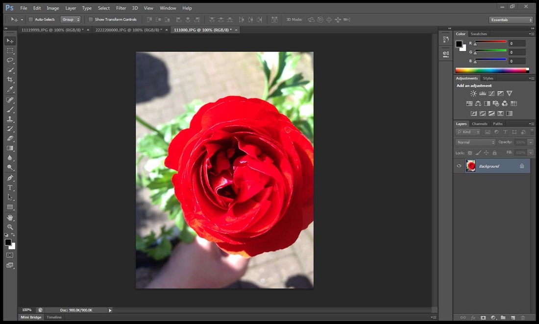
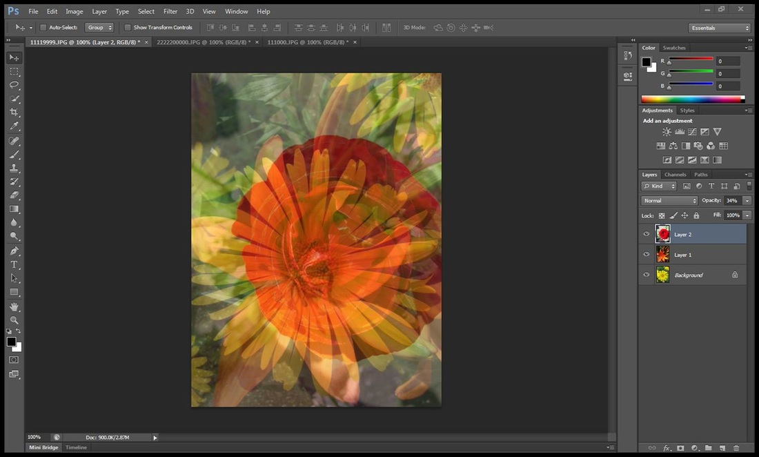
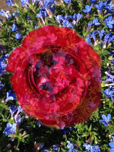
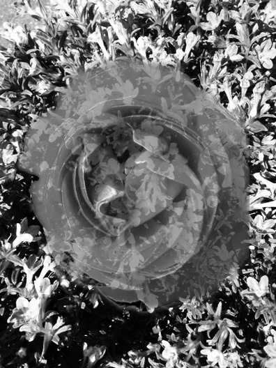
Combining Lisa Milroy and Karl Blossfeldt Images Together
Lisa Milroy |
Karl Blossfeldt
|
|
|
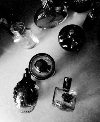
I mixed Karl Blossfeldts effects with Lisa Milroy's photo to experiment what the picture would look like. I think this picture does not work well with Blossfeldts effects because Lisa Milroy's photo effects was good how it was and black and white effects mixed in with it did not improve the picture. the image didn't suit the black and white effect so her image is more worse.
I used Lisa Milroy's effects on Karl Blossfeldts work to see if both effects would combine together. I think personally the picture with Lisa Milroy's effects suits and works because flowers like this makes the image colourful and pretty which all flowers want and I think the red colour makes the flower stand out more from the background so that's why I think this picture suits the effects.
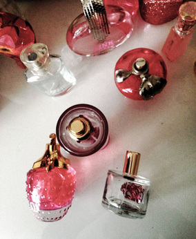
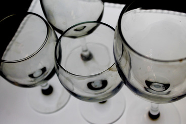
Combining Albert Renger Patszch and Cory Arnold
I used Cory Arnolds work on Photoshop to edit in the style of Albert Renger Patzch. I used the black and white effect under properties and I decreased the red effect to 40 so the background cancels out and makes the image darker. I finally then used the yellow effect to increase the lighting of the picture so the legs of the animal in the picture would stand out and have two effects of different photographers in one picture.
I used a similar way of showing his work but in a different way. I used Albert Renger Patzch work with Cory Arnold's effects. I went to properties and saturation and used the red and blue tool to increase the outlining's of the glasses so they are colourful. I then went to curves and bended the line in two separate directions so the image would become more silver and grey so there are two types of effects in one picture.
Ghosting Albert Renger Patzch and Karl Blossfeld Work Together
I used both Karl Blossfeld and Albert Renger Patzch work which has both the same effect and I ghosted them by transferring loads and loads of flowers (Karl Blossfeld) over to Albert Renger Patzch glass photos and ghosted them by making the flowers lighter.
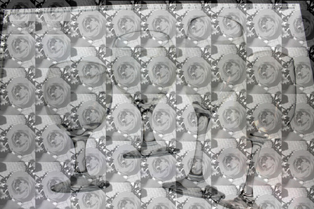
I like this picture and by doing this I saved both Karl Blossfeld and Albert Renger Patzch work into my area. I then clicked onto Photoshop and then I went to file and opened my glass photo because I am using it as my stable background image. I then clicked onto file and then open again and opened up my second image of flowers. I then transferred a flower image onto the glass photo in small sizes, I then kept on transferring loads and loads of identical images in small sizes of them and put them in 9 rows going down so its a nice pattern. I then highlighted all the layers and used the Opacity tool to make the images lighter so it blends in with the background image of the glasses. its now just an black and white image with both images blended in. for the finishing touches I went to properties and then went to colour balance and then I clicked on the red colour and increased it all the way to the top so it looks like this. this is how I made this image look like this.
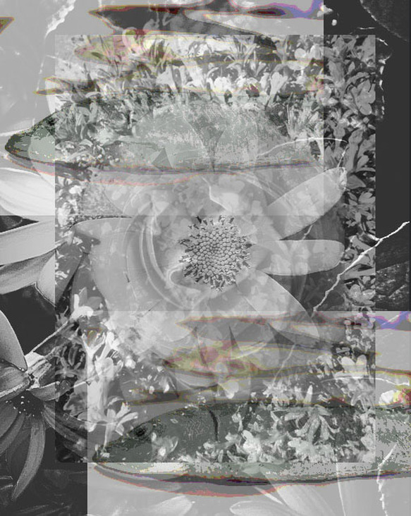
Experimenting Ghosting on Karl Blossfeld and Cory Arnold.
This was my first edit in ghosting I done and I think this image is my best one because the colours and effects blend in well and the two images of the fish are in a pattern because one is at the bottom of the picture and the other is at the top of the picture. also you can see both images in one image such as the flower which makes the image looks outstanding.
personally I think this image is my weakest edit because you cant figure out what the image is trying to tell you and you do not know which picture is which. Also the effect doesn't blend in well with the fish because just above the fish is a mixture of black, red, green and pinky orange which doesn't make the image look nice. this is why this edit image is my weakest.
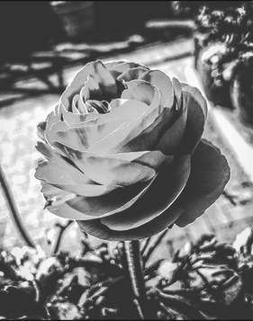
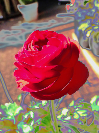
Refining My Ideas With Karl Blossfeld
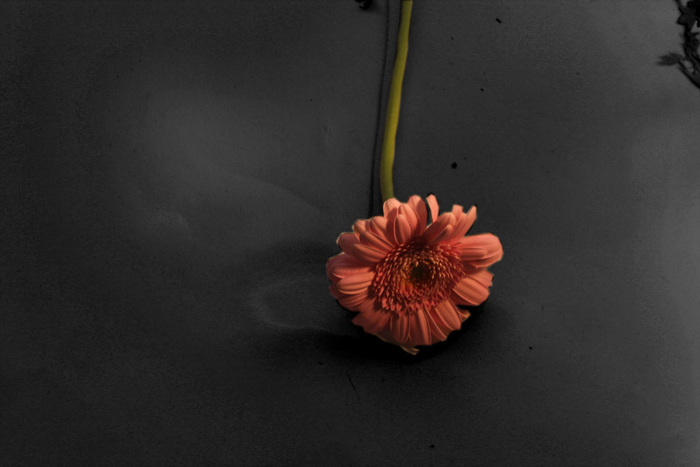
I have pictures of Karl Blossfeld work and he shows that his background in his pictures are very dark so I used Photoshop to refine my ideas. I like this picture because it shows two effects that combine with each other to make a overall good display. I also like this picture because it makes the flower image stand out more so it looks like there is only a flower in the picture. it also shows that the background cancels out and that it is similar to his work. Finally the last point which shows this is a good picture is the middle part of the flower. before I edited this you could hardly see the middle part but when I made it darker it showed what it looked like; brighter and more colourful.
Step By Step Process Of How I Got To This
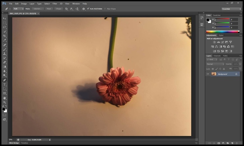
I clicked on Photoshop and I went to File and then open and opened up a picture in which I saved.
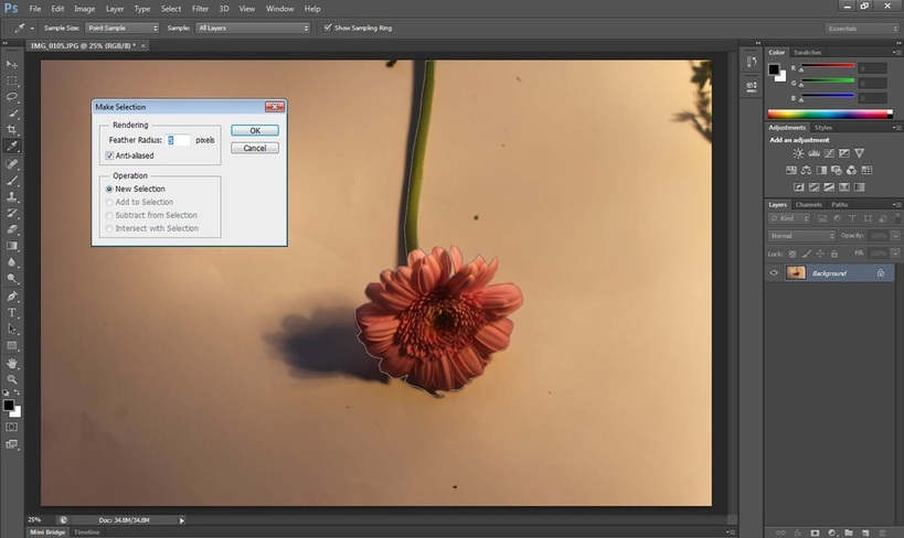
I clicked on the cut out tool ( the 15th one down on the tool section) and I cropped round the flower as it looks above and I right clicked on the mouse and went to Make Selection so it comes up with a box which says Rendering. the number was on 0 so I changed it to number 5 and clicked okay so the flower is cropped.
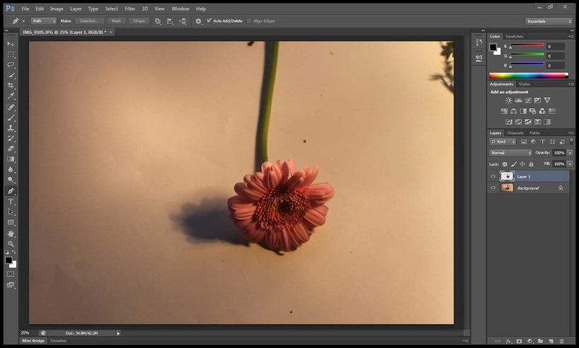
After you clicked okay on the make selection box, it should look like this and now you've got to make a layer and how you do this is that you click edit and press copy and then straight away after click paste so it looks like. now you have a layer so the flower stays the same and cannot be edited.
You now click image and then adjustments and then Black and White so you will see different colours which represents an effect on black and white. I reduced the red colour to -166 so the background becomes darker and I also reduced the yellow colour down to -33 so the shadow of the flower wont stand out too much and now it should look like this.
Other Examples Of Refining Ideas Towards Karl Blossfeld


My first edit I done with this picture was ghosting but without black and white because I am experimenting on both techniques (with black and white/ without black and white) to see which one I think is the best one. Personally I think this picture is my weakest because it doesn't suit Karl Blossfeld work and the edges of the flower looks like I done a mistake with cropping the image. there is one positive to this though. the two images blend in well and in the centre of the flower image is bits of the background image which is peeking through. But overall this experiment is my weakness picture.
Personally this picture is my best experiment because it relates to Karl Blossfled work and the background doesn't look the same like the other experiment which that background stayed the same brightness. the black and white experiment on the background has lighter areas on the leaves and the stems below the leaves is contrasted darker. the edges of the flower doesn't stand out, they blend in well which the background so does the middle part of the flower. this experiment shows more development than the other experiment and that's why this edit/ ghosting is my best experiment.
Resolving My Ideas


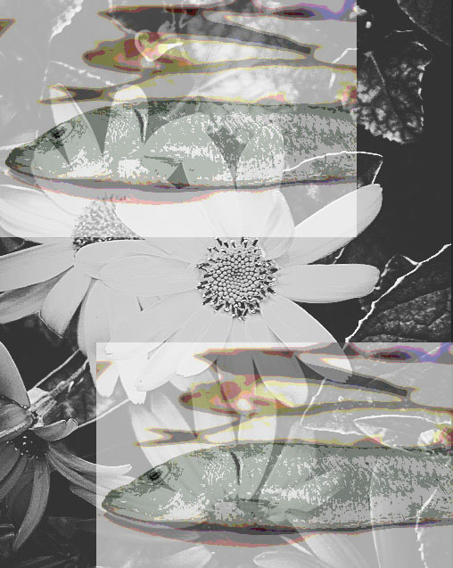
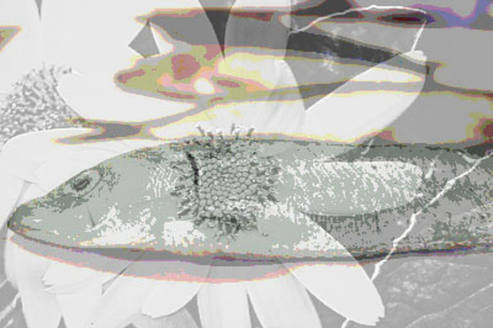
I combined my ghosting edit of the red flower on top of the background leaves in black and white and the picture of the two images of a fish on top of the flower background as one of my final pieces because they all blend in very nicely and I like it because it proves how much hard work I've done to make this image. I used Cory Arnold and Karl Blossfeld work for this process. another reason why I chose and made this picture was because everything in the picture all standed out. the pictures of the two fish emerge from the ghosting and the leaves from both sets of pictures all show to make the picture have amazing art details in it. my last reason why I like this picture is because in this picture it shows a mixture of different emotions and different backgrounds put all in one. How I done this process was that I went onto Photoshop and clicked file and open and opened up both images. I then dragged the picture of the ghosting red flower onto the picture of the two fishes and flower. I then dragged the opacity tool down to 30 percente so the picture of the red flower would emerge but the fish and the leaves in the background from the other image was still hidden by the red flower photo so I used the fill tool to decrease/ emerge the picture down to 30 perecente as well, so the pictures of the two fishes was seen. the picture should now look like this.
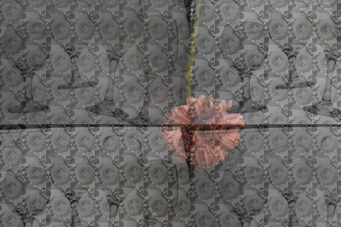
This is my second Final piece. I chose this because I like the repetition of the glasses surrounding the flower which is in the middle. I also like that the small images of the flowers, which is blended in with the glasses, emerging in the background. it makes the picture look top quality. I also chose this as my final piece because the picture is organised and is in a nice pattern. I chose the flower to go with this because it puts colour in the picture which shows there is two effects instead of one because if there was one effect to the picture then it would be dull and boring. The step by step process I done to get this was that I went to Photoshop and then file and open to open up my two images. I then dragged the picture of the glasses and the small image flowers onto the flower image four times and put them in four sections, top left, top right, bottom left and bottom right. I now have four layers and I clicked on every layer and used the opacity tool to emerge the four layers in every four sections so it looks like this which Is the finishing product.
